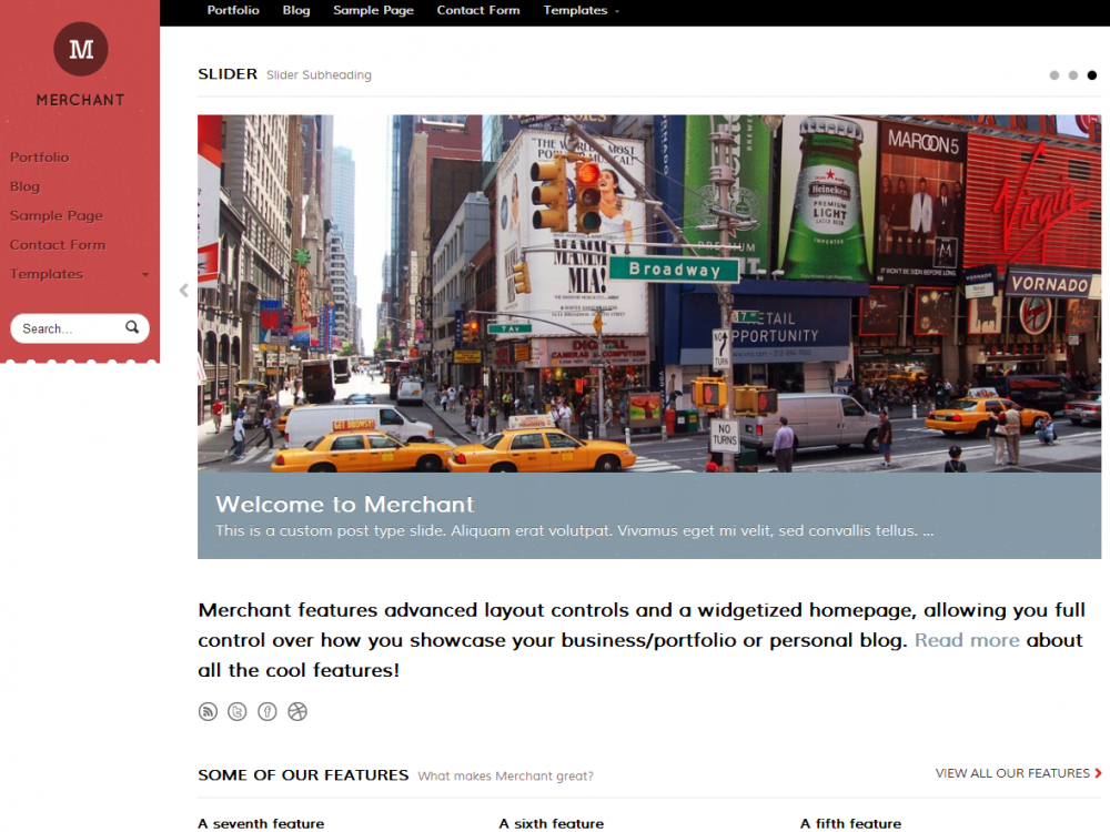
Merchant is a responsive portfolio, personal or business theme with a homepage that is truly flexible thanks to the Woo Component widgets. With JS Masonry, some advanced layout controls to set the site width and a header that can be fixed or floated next to the site you can really have some fun customising it.
Unique Features
-
Fully Responsive Design
The design will scale to fit on all browser widths/resolutions and on all mobile devices. Go ahead and scale your browser window and see the results.
-
Custom Homepage
In addition to the multiple sliders, the theme consists of a customized widetized homepage where you can add and re-order the included custom components (Slider, Intro, Features, Portfolio, Feedback, Promotions, Content, Blog) with the Woo Components widget.
-
Multiple Sliders
A custom homepage featured slider is available to showcase your important content, all powered by the fully responsive FlexSlider, which makes it usable on mobile devices. You can put images or videos in the slider posts, and link the slider posts to another page or website. You can even have multiple sliders on the homepage thanks to the Woo Components widget documented above – just drag and drop multiple sliders into the homepage widgetized region.
-
Advanced Layout Controls
The “Layout Options” give you a vast array of customizability allowing you to “Float” the Header – http://cl.ly/Fkru – or you can also have it “Fixed” so it scrolls with the site. The floated header is also responsive, so if there’s no space for it to float, it drops back to the header section in the standard layout. You can also set the content width of your site (dynamically calculating the width for the floating header
-
Powerful portfolio management
The portfolio section of Merchant is powered by it’s own custom post type with a summary of your portfolio viewable on the homepage module and then it’s own portfolio page template to house the rest.
-
JS Masonry
The Features, Blog and Portfolio sections on the homepage are cleverly lined up bricks-and-mortar fashion for a perfectly fluid layout that adapts as your browser width changes.
-
Custom Typography
You can customize the typography in the theme to suit, and there is full support for Google Fonts in the font selector. By default it is using theSignika font.
-
Custom Widgets
In addition to the widgetized homepage and the custom module widget, the theme has 1 widgetized sidebar and up to 4 footer widgetized areas, and as always comes with custom Woo Widgets (Ad Space, Blog Author, Video/Embed, WooTabs, Subscribe & Connect, Search, Flickr and Twitter).
-
Styling Options
The theme includes a variation of alternative styles which you can preview in the demo, and also has styling options for background color/image and setting link and button color.
